Emerald Line – Custom Restaurant Menu
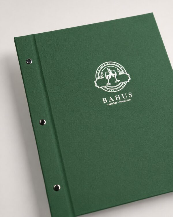
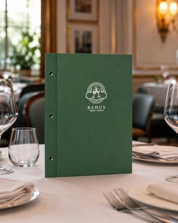
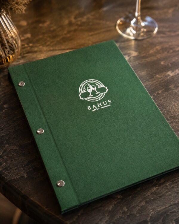
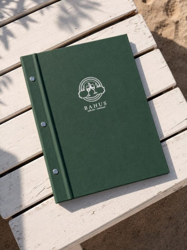
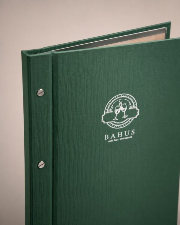
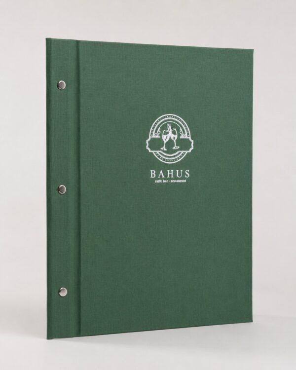
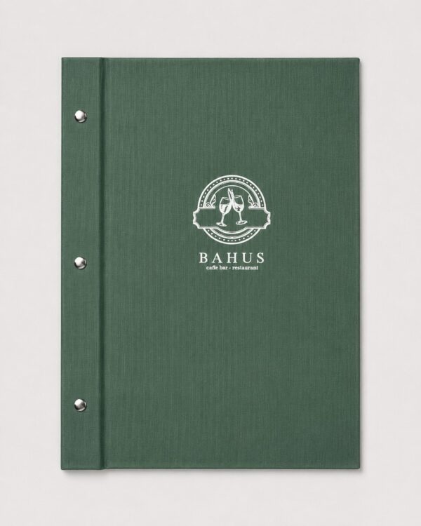
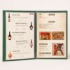
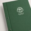
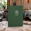
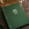
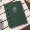
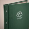
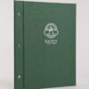
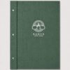
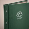
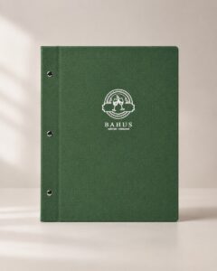
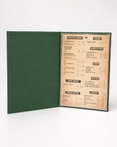
Emerald Line is a custom restaurant menu that stands out with its deep green cover and clean, understated appearance. The front features the hospitality establishment’s logo, while three metal elements along the left edge form a distinctive detail of this model.
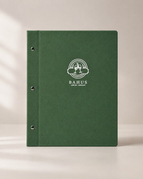
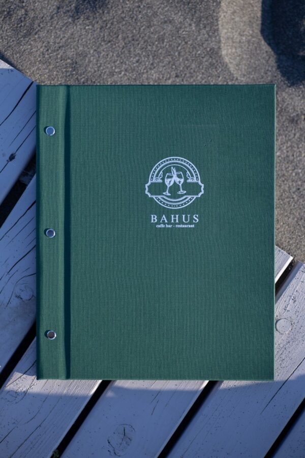
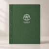
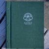
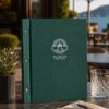
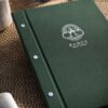
On the example shown in the photographs, made for Bahus, the light-colored logo is placed in the center of the front cover. The contrast with the green background allows the mark to remain clearly visible without the need for additional text or decorations.
Emerald Line Menu
With the Emerald Line model, green is not just a detail. It defines the appearance of the entire cover.
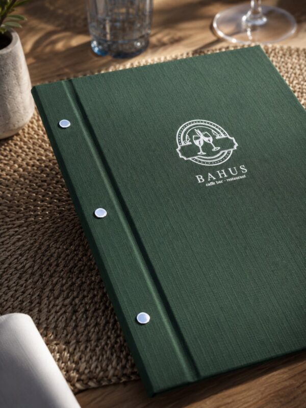
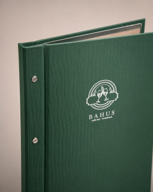
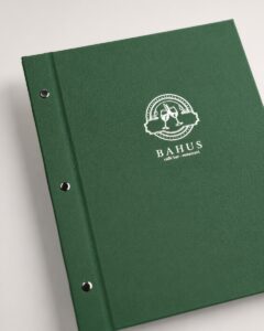
The surface has a fine texture that is best noticed in close-up photographs. Instead of combining multiple colors on the front, a single dominant shade is maintained, along with the light logo and metal details.
This arrangement leaves plenty of empty space around the restaurant’s mark. As a result, the logo does not need to be large to attract attention.
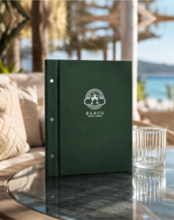
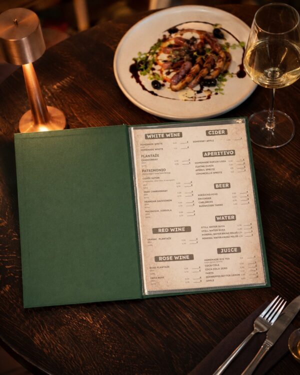
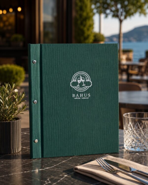
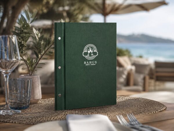
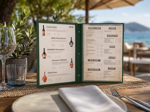
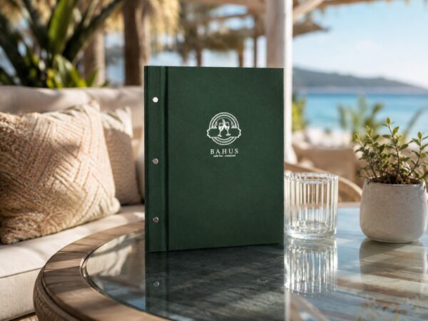
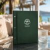
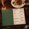
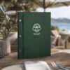
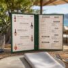
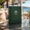
A particularly interesting effect is achieved when the menu is placed in an environment with wood, plants, and natural tones. The green then does not appear as a separate color, but can become part of the overall look of the space.
Custom Restaurant Menu
The cover of the Emerald Line model shown features the Bahus restaurant mark. It is placed directly on the front surface and represents the main element of customization.
This solution allows the restaurant to obtain a distinctive cover without adding generic labels and decorations.
When producing a custom menu, it is important to consider the logo itself. Its shape, details, and color affect how it will appear on the chosen background. On the darker green shade of this model, the light version of the mark creates clear contrast.
Therefore, customization is not just placing a logo on an already finished cover. The logo and color should be viewed as parts of the same visual solution.
Three metal details along the left edge
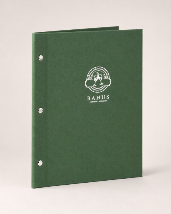
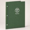
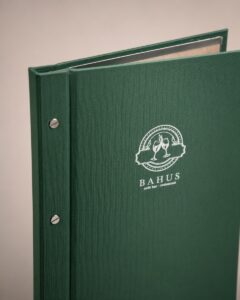
Emerald Line has three round metal elements arranged vertically along the left side.
They are small enough not to take attention away from the logo, but due to the metal finish they are clearly distinguished from the green surface. Their arrangement also emphasizes the left edge and gives the model a characteristic appearance when closed.
In the studio photograph, this detail is particularly visible, along with the texture of the cover and its shape.
Compared to models with a more concealed binding system, with the Emerald Line variant the metal elements remain part of the product’s external appearance.
Green as Part of Visual Identity
Black and brown covers easily fit into a large number of spaces, but they are not the only option for hospitality establishments.
Emerald Line is an example of how a more pronounced color can be used when it suits the restaurant’s character. Darker green can be particularly interesting for establishments that already use this color in their logo, interior, or other brand elements.
The photograph of the Bahus model shows exactly this effect. The menu placed in an environment with natural tones and greenery appears as part of the space, not as a completely separate object on the table.
Therefore, the choice of cover color makes sense to consider together with the environment in which the menu will be used.
Fewer Details, More Space for the Brand
The front of the Emerald Line model is not filled with text.
There is no large “MENU” inscription, additional frames around the edges, or multiple different graphic elements. Most of the cover is left in green, and the establishment’s identity is conveyed through its mark.
This is particularly useful when the restaurant already has a logo that functions well on its own as a central element.
Instead of adapting the brand to a pre-made design, the cover’s appearance can follow what the establishment already uses in its visual communication.
Emerald Line for Restaurants in Serbia
Fabrika Menija produces custom menus and covers for hospitality establishments. Emerald Line represents one of the options for restaurants that want to move away from standard black and brown variants and use color as part of their menu’s identity.
A classic menu can also be combined with a digital menu when a restaurant wants to make its offering available to guests via phone as well.
Emerald Line custom restaurant menu is recognized by its green textured cover, light logo, and three metal elements along the left side. On the Bahus model shown, it is precisely this simple combination that gives the product its character, without the need for additional decoration.